2017–2019 Mozilla Protocol
Building Protocol: a web design system for Mozilla.
Mozilla is the non-profit behind Firefox, and is committed to ensuring access to a healthy and open internet for all.
Problem: Before I joined Mozilla in 2017, website design had not been a high priority. The broken processes resulted in a website that had no consistency, little consideration for mobile, and no potential for re-usability of code.
We had 30 different buttons, 2 or 3 different CSS frameworks, and almost 20 years of technical debt on mozilla.org
Solution: The clear task at hand was not to redesign the web pages themselves, but instead to permanently change the process by which we designed and built web experiences as a team.
I helped build a core Design System team, and contributed as project lead and lead designer. Initially, our distributed team consisted of two designers and two front-end developers. We named our project Protocol (after the http pun inside the Mozilla logo), and really focused on usefulness, accessibility, consistency, and reusability.
What did we do?
At this point in time, Mozilla was really leaning into an editorial presence, built around raising awareness of its work in policy, advocacy, and the health of the internet landscape.
Protocol started with a robust type scale (based on the beautiful Zilla Slab), and a card component to support our editorial style layout on the homepage, which helped showcase the full range of all the non-Firefox projects that the Mozilla Brand Team was working on.
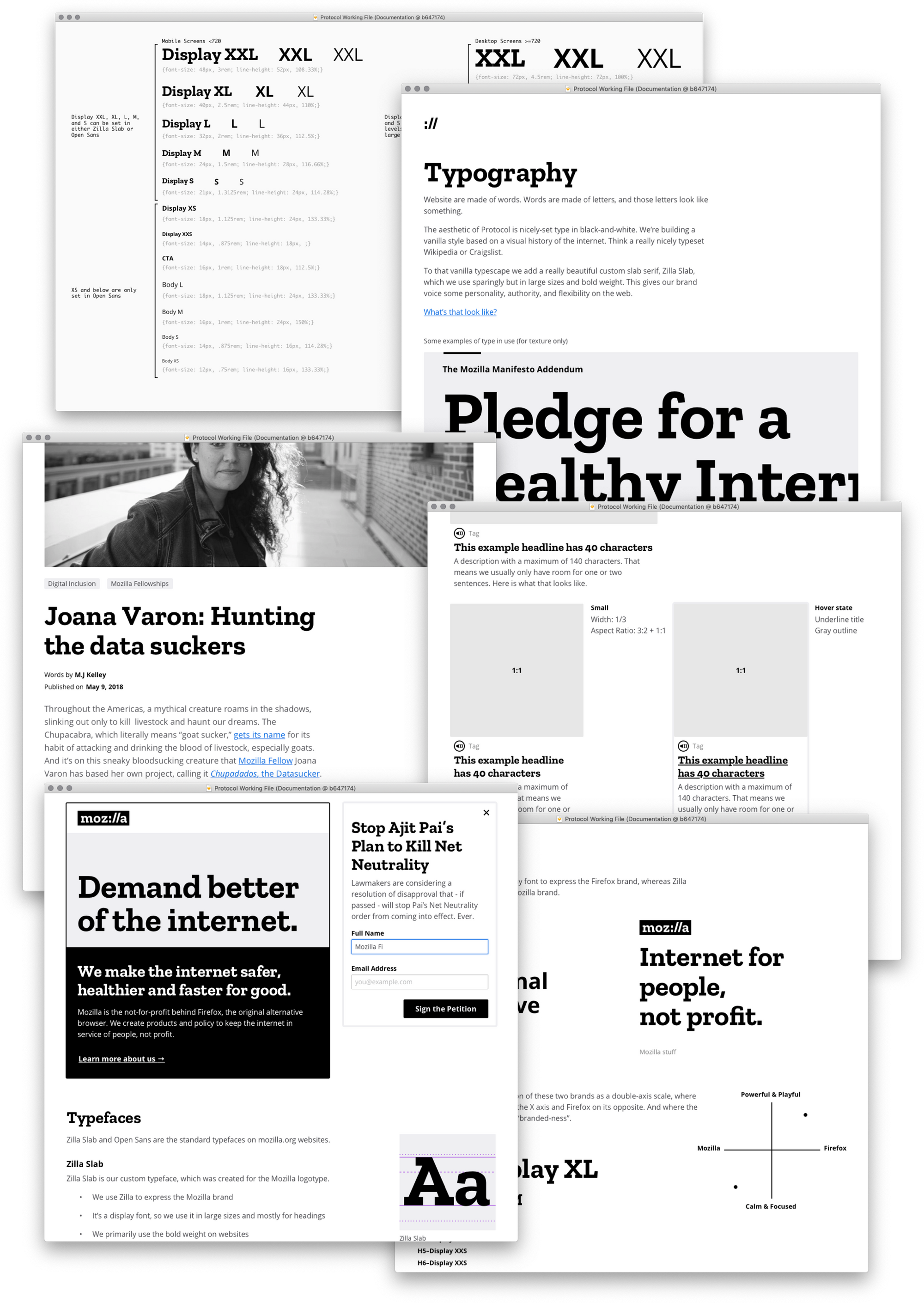
We took a visual approach that would allow us to grow into a fairly new brand identity. Our aesthetic was based on “default web”. We used blue for links, purple for visited links, and black and white as our default palette. It was designed to be vanilla, so we could focus on consistency as our starting point.
We overhauled our navigation with a mega menu, and began to consider how motion design could start to add meaningfully to our system.
And then it was time to tackle the buttons. We needed to focus on accessibility and consistency, and hone our decision-making skills.
I wanted to ensure that button hoverstates always improved color contrast, or at least keep it even.
My proudest achievement on this project was implementing a consistent and accessible button for downloading Firefox.
After a few months of work it was time to sell Protocol through to the entire marketing organization. A design system is only valuable if folks actually use it. So we had to do some marketing within marketing. We continued to expand the definition of what Protocol is, who it’s for, and grow the number of contributors to it.
Next Project →